[ad_1]
To business executives and marketing professionals, everything is numbers. Watch the news and pay attention to when a broadcaster states a number. Reading, seeing or hearing numbers is easy. Blindly repeating them is easy. What’s hard is validating the data, understanding it and then putting it into a meaningful, useable format.
Context matters in data analysis
“Numbers out of context are just numbers!” is a mantra I frequently use during presentations and keynote addresses. I follow it up with, “Give numbers meaning by putting them into context.”
Most people trip and stumble because they can’t put numbers into context. Many people will use perceived high-quality numbers out of context. “We just got an ROI of 15% on our last marketing campaign.” This sounds impressive, but is it?
What if previous campaigns over the past two years averaged a 25% ROI? Then, the result of this campaign is not good. However, if the average ROI on campaigns was 10% during that period, then this latest campaign did well.
When analyzing analytics data, it is critical to put it into context. This applies to everyone on the marketing team and anyone reporting to the C-level executives. After all, those executives have to explain the data to the board of directors, lenders, the press or anyone else.
To help them understand what the data means, look beyond the obvious. Tell the story around the data instead of assuming people will figure it out by themselves.
Dig deeper: Marketing analytics: What it is and why marketers should care
The art of contextualizing data
A meme circulating a few years ago demonstrated how data can be counterintuitive. It showed a World War II fighter/bomber plane and where the bullet holes were upon its return. People looked at this data (where the plane suffered damage) and said, “We need to reinforce these areas.”
Then a mathematician looked at the same data and said, “You are wrong! We need to reinforce the areas that were not hit!”
Responding to the perplexed look of those ready to work on the planes, he explained, “What you really want to do is armor up the areas that, on average, don’t have any bullet holes. Why? Because planes with bullet holes in those places never made it back. That’s why you don’t see any bullet holes there on the ones that do return.”


Applying context to marketing metrics
When we look at our data, we need to think like that mathematician. What do the numbers mean?
Saying that an SEO project was a success because the average position rank in Google increased from the 3.5 position to the 2.5 position doesn’t say anything.
- Which words/phrases moved?
- Did all the phrases that moved up include branded terms? If yes, well, you better be ranking No. 1 for branded terms!
- Did that increase in position result in more traffic to the site?
- Was that increase in traffic quality traffic (did it engage, did it convert, etc.)?
These are the questions and answers we need to include when reporting numbers to generate meaningful context (the data story) for the data.
The same rules apply to offline marketing efforts. Think about TV commercials, billboards, bus ads, etc. I’ve seen many ad agencies pat themselves on the back, especially if they won an award for their work (usually a peer-based award).
Do they quantify the success of their efforts? Typically not. Yes, people might speak of that latest campaign, but what did it do for their client? Can they quantify that they increased brand awareness? Maybe yes, but did the increase in brand awareness result in more sales?
If you doubt that quantifying offline advertising is too expensive, too complex and too time-consuming, think again. The Burma-Shave company was doing it in the 1930s. This company started in the mid-1920s. They manufactured and sold men’s brushless shaving cream and got creative. They created a series of roadside billboards targeted at the ever-growing car traveler.
By simply evaluating local sales in the towns that came after the billboards, they were able to determine the best height for the billboards, which color generated the most sales and which series of billboards contributed to the increases in sales.
The result? Within a few years, this startup was the second highest-selling brushless shaving cream in the U.S.
Techniques for effective data presentation
Over the years, it has become so easy to obtain campaign data, website performance data and financial data that we are overwhelmed by the data. Many find it easier to simply capture the most easily obtainable data points and report them as key performance indicators (KPIs). By doing so, we are short-changing our clients/customers and ourselves.
The easiest way to put data into context is not to report absolute numbers, standalone numbers or even basic comparisons (A vs. B). Reporting an ROI of 15% might seem like a ratio, but it is still just a number out of context.
Reporting an ROI of 15% for campaign X vs. an average campaign ROI of 5% for the past two years puts it into context. Saying why it is higher than average gives meaning and context to the data.
An SEO example: Last month’s performance
| Average increase in position | 0.5 |
| % Increase in Organic Traffic | 2% |
| % Increase in Engage Organic Traffic | 1% |
| % Increase in Sales from Organic Traffic | 10% |
In this example, it is easy to see that while the average increase in position might not appear significant (not a major change in website traffic nor engaged traffic), the next result was a significant increase in sales.
This SEO story of the data might be:
- “The SEO effort, while only generating minor changes in position and traffic, was effective at capturing our target customer, resulting in an increase of 10% in sales from organic search traffic.”
In a perfect world, an extra line of context would show the ROI of this effort (using the formula Sales – Product costs – Overhead costs – Cost of SEO / Cost of SEO).
Dig deeper: Data visualization: How to transform analytics data into actionable insights
How to avoid sending or receiving numbers instead of data in context
Challenge those who ask for numbers. What are their plans with the data? Then explain to them that just providing numbers with no context is like serving you a quarter-pound burger, but with no bun, no toppings and the meat hasn’t even been pressed into a patty. They’re getting a quarter pound of ground meat.
Challenge those who give you numbers (the analysts). Tell them how you plan to use the numbers and that just providing you with numbers out of context is the same as them serving you a quarter-pounder, but you have to make the bun, cook the meat and assemble the burger. If all you wanted was the data, they could have just as easily granted you access.
The nuances in reporting data are to look beyond the numbers. Dig deeper into what they are trying to tell you, what they truly represent and how they can benefit your organization.
It does take time to get all the data. Yes, report turnaround times are getting shorter and shorter. You will likely need to automate the data extractions and budget additional time to review all data and put it into context.
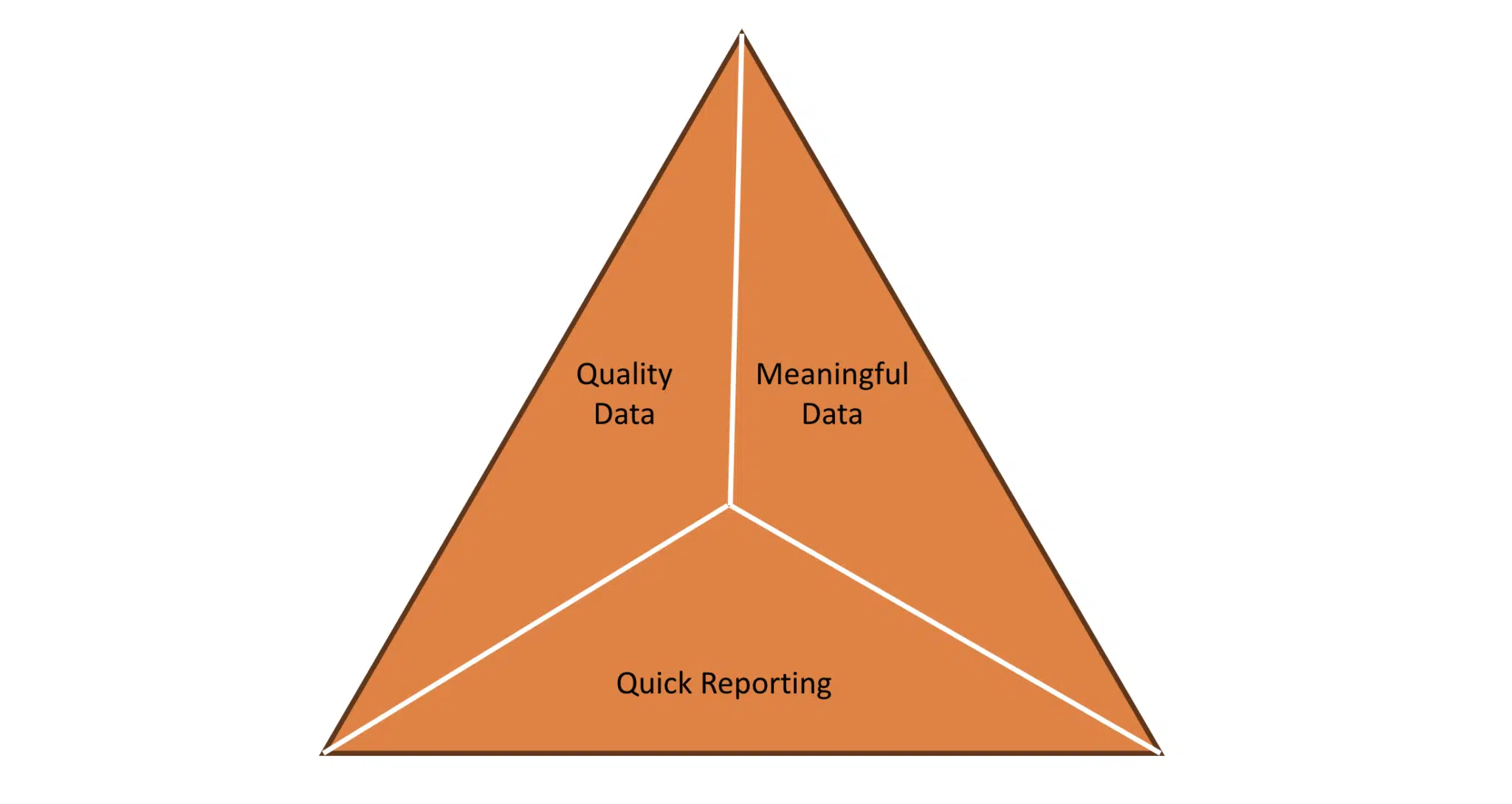
Proper business decisions can be made only when all the data is put into context. The old business triangle needs to be deployed: You can have quality data, meaningful data with context or you can have it quickly. Pick two.


As business professionals, we all need to review data for its accuracy and what it tells us. Ensure your team understands that it is not just the important data but the meaning (the context) behind it that truly matters. Only with data in context can we make fully informed business decisions.
Dig deeper: 3 ways MOps can bridge the gap in marketing analytics
Contributing authors are invited to create content for MarTech and are chosen for their expertise and contribution to the martech community. Our contributors work under the oversight of the editorial staff and contributions are checked for quality and relevance to our readers. The opinions they express are their own.
[ad_2]
Original Source Link


