What do you spend more time on in your email program — how to acquire subscribers or how to let them go?
Judging by the results of a quick study I conducted over the last few weeks, retail email marketers give the unsubscribe process far less attention than it deserves.
Because of that, they miss opportunities to retain customers within the brand sphere, even if they no longer want to receive emails.
But, I also found many areas where brands can turn the negative of an unsubscribe into a positive event. Also, the unsubscribe process is generally better than it was when I conducted a larger study on unsubscribe practices in 2016.
Dig deeper: Why we care about email marketing: A marketer’s guide
Overview: 5 insights from brand unsubscribe journeys
I wanted to learn whether ecommerce email marketers are managing the unsubscribe better today. In general, I found some improvements but also discovered some brands still use old tricks like burying the link in the footer and camouflaging it in a low-contrast font.
Here are my top discoveries from my review of 12 ecommerce brands, six based in the UK and six in the U.S. I’ll present detailed findings further down in this post.
- UK brands offer a smoother process than U.S. brands, but marketers on both sides of the pond can improve their out-opt process to give customers a better experience.
- The one-click unsubscribe is more prevalent among UK brands but some brands make the process less transparent.
- U.S. brands put unsubscribers through more steps but gave subscribers more options.
- Most brands still play hide-and-seek with the email unsub link.
- Brands can do much more to keep customers connected without also making the unsubscribe more cumbersome.
Before revealing my detailed findings, I’ll share my views on unsubscribing and why it matters.
Marketers neglect the unsubscribe
Gathering in more subscribers does more for the company than letting them go. For many brands, the opt-out link is there in the email because a law requires a working unsubscribe in every email.
But the laws don’t mandate where the link goes or the language around it or even how to present it. That’s one area where many marketers tend to play a little fast and loose with the legal requirements.
Dig deeper: 8 major email marketing mistakes and how to avoid them
The unsubscribe matters in the customer experience
The unsubscribe process is part of the customer journey with your brand. A painless unsubscribe is just as important as a warm welcome. It can even help you retain customers, even if they move away from your email.
Don’t forget the deliverability angle, either. In most email clients today, the “report spam” button is right up front. For a lot of email users, that’s the opt-out choice. The result: Major dings on your sender reputation and faster trips to the spam folder.
And now for my findings!
1. UK brands give subscribers a faster process than U.S. brands, but…
…marketers in both countries can improve their out-opt processes to create better customer experiences
Among the six UK brands I reviewed, none required more than two clicks to complete the unsubscribe. They also pulled in my email address. The process for the six U.S. brands took more work — three or four clicks — and most didn’t load my address on the website.
But even with those extra clicks, I can see improvement in the unsub process since 2016. In that study, one brand made me fill out seven (seven!) form fields to complete the unsubscribe. Overall, the unsub process is far more mobile-friendly today than it was five years ago.
How to improve
The UK brands speed their subscribers through the unsub process faster than the U.S. brands, but this efficiency comes at a price: fewer opportunities to learn why their subscribers are opting out or to give them a chance to stay in touch.
An immediate confirmation like this one from the Cotswold Company does not reflect the brand’s warm and welcoming brand or voice.
Maybe I didn’t want to unsubscribe — maybe I wanted to update my email address. But I didn’t get that option in the unsub journey.

U.S. brands have more time with their departing subscribers but risk losing them by asking for too many clicks or data.
At a minimum, the subscriber’s email address should load automatically on the website’s unsub page. This is better for mobile users and takes one more speed bump out of the journey.
This opt-out form for Big Lots (U.S.) is typical:
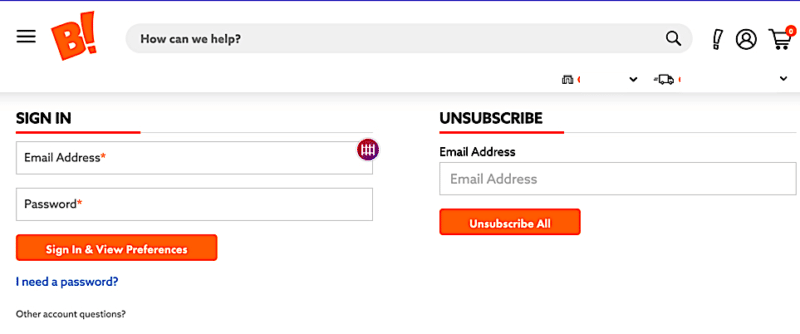
Updating your database to pass the email address through to the unsub page might take some doing.
But 10 minutes could be all you need to replace the user-unfriendly language on your confirmation page and add a link back to your website for customers who might still want to shop.
2. The one-click unsubscribe is more prevalent among UK brands but some brands make the process less transparent
Three of the six UK brands use a one-click unsubscribe, in which clicking the email unsub link launches an unsub confirmation on the brand’s website.
As I mentioned previously, with a single click on the email link, I didn’t have to fill in my email address and then hit “enter” or “submit.” The result: A simple confirmation page like this one from Great Value Vacations:
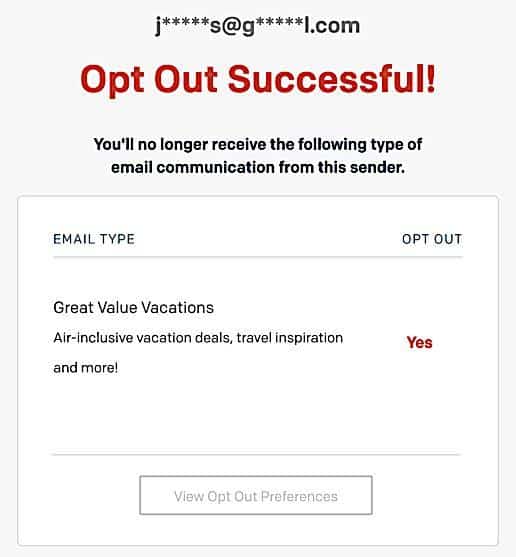
The other three brands required two clicks: one on the email unsub link, and then a second on the website to confirm my intention.
This efficient process likely stems from tighter regulations about email data management in GDPR (a holdover from pre-Brexit days) or the UK’s own email laws.
However, it doesn’t protect against accidental unsubscribes or curious subscribers who are looking for reassurance that they can unsubscribe easily as and when they want to.
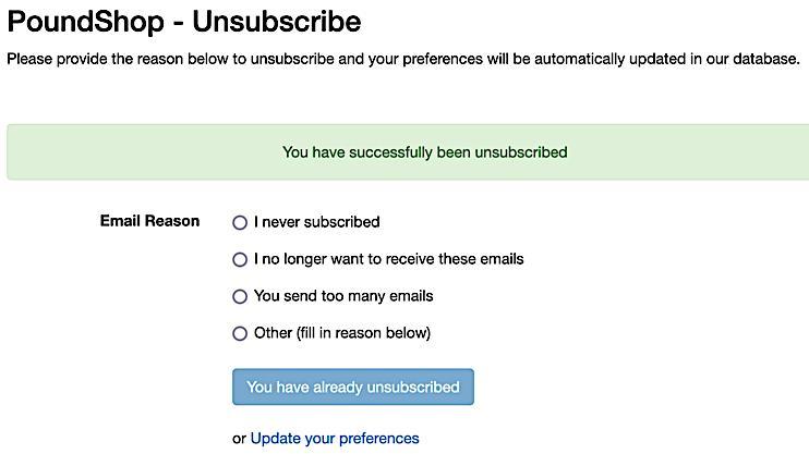
Another sticking point: confusing directions. PoundShop’s unsub page asked me for a reason why I was unsubscribing, but when I clicked the blue “Unsubscribe from all marketing emails” button, I saw this confirmation page:
How to improve
A one-click unsubscribe is a win for your database and deliverability teams and for subscribers who just want off your list. But it costs your marketing teams (social, web and mobile, not just email) plenty in customer engagement.
You can avoid accidental unsubscribes by breaking up the links in your email footer or converting your text link to a button. This way, someone who wants to click on an FAQ or contact information is less likely to tap the unsubscribe link by mistake.
Make your unsubscribe journey more intuitive. How long has it been since you jogged through your own process?
Do it on your next work break. Look for conflicting or confusing instructions. Better yet, have someone who isn’t an email professional test it.
Dig deeper: Opting out: A guide to letting go of email subscribers the right way
3. U.S. brands put unsubscribers through more steps but gave subscribers more options
Me, unsubscribing from a Costco email:
Scroll, scroll, scroll to find the link in the email footer, only to discover Gmail has clipped the email because it’s too long. Click to view full email.
Scroll to the email footer to find the unsub link. Click.
Review my options to change frequency or unsubscribe. Click. Go to the “Update My Preferences” button. Click.
Total clicks: Four.
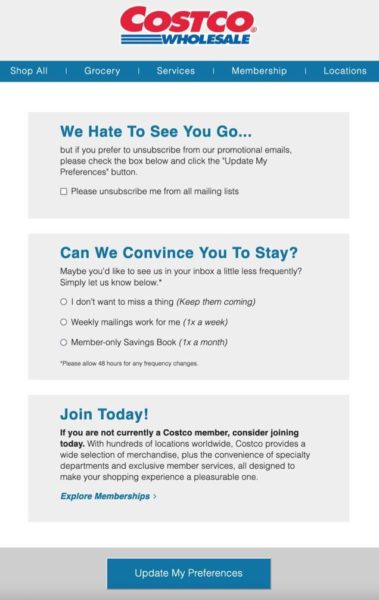
That’s a lot of clicks, especially on mobile. But the other U.S. unsub journeys I reviewed are just as click-heavy, even when their links don’t get cut off on a clipped email.
On the plus side, U.S brands also put more effort into communicating at all those points on the journey. Unlike the bare-bones email confirmations from UK brands, the U.S. brands gave me many opportunities to change my mind or fix a mistake.
These brands sometimes felt like persistent ex-boyfriends who couldn’t accept that I was done with them. But at least I didn’t feel as if the brand had slammed the door in my face just because I didn’t want its emails anymore.
How to improve
Look for ways to take even one click out of your process, but still provide the options. Each click on the journey is a potential failure point, and each failure point is a potential spam complaint. One way, again, is to load the unsub page with the subscriber’s email address and offer a blank if the address somehow isn’t the one they want to use.
Get MarTech! Daily. Free. In your inbox.
4. Most brands play hide-and-seek with the email unsub link
My experience trying to track down an elusive email unsub link was not confined to Costco’s email. Eleven of the 12 brands put the unsubscribe link only in the email footer, often in a section that didn’t show up if the email client clipped the message for length.
Burying the link wasn’t the only problem. Links in tiny font sizes, font colors that blend in with colored backgrounds and other design tricks are just stalling tactics. They don’t work — at least not the way you think they will. Subscribers will take the path of least resistance to get off a list, and that path usually is the spam complaint button.
How to improve
If your emails are prone to getting clipped, test whether an unsub link higher in the email gets more clicks. No U.S. brands in the study used this tactic, but I saw it in an email from UK-based Asda:

Be careful not to let your unsub link get pulled into your preheader unless you also have deliverability problems resulting from high spam complaints. The link could go in the next tier of copy below your logo, for example. It’s definitely something to test.
Also, if you must post the unsub link in your footer, make it eye-catching. Superdrug (UK) uses a bright pink unsub link, which is great. (“Click this link” isn’t a great substitute for “Unsubscribe here,” though.)

5. Brands can do much more to keep customers connected without also making the unsubscribe more click-heavy
Goodbye doesn’t have to mean “get lost.”
Opting out is as much a part of your customer’s email journey with your brand as opting in and deserves just as much care and attention. A negative experience with unsubscribing can even cost you a customer.
Here are five ways to make your unsubscribe process more user-friendly while also giving you data you can use to learn about your unsubbers:
Remove as many speed bumps in the process as you can without cutting yourself off from important data or giving your subscribers a chance to stay connected. This process starts in the email with an easily found and clearly labeled unsub link or button.
Add personalization and branding to every page in the unsubscribe journey. Personalization on an attractive page makes the whole process feel more friendly. Revisit your unsubscribe pages often to make sure they reflect your latest templates and logos.
Upgrade the language so it reflects both your brand voice and what your subscribers want to do. Use your marketing smarts to frame the content. The copy should never sound as if a robot wrote it. “Submit query” throws cold water on what might normally be a fun brand experience.
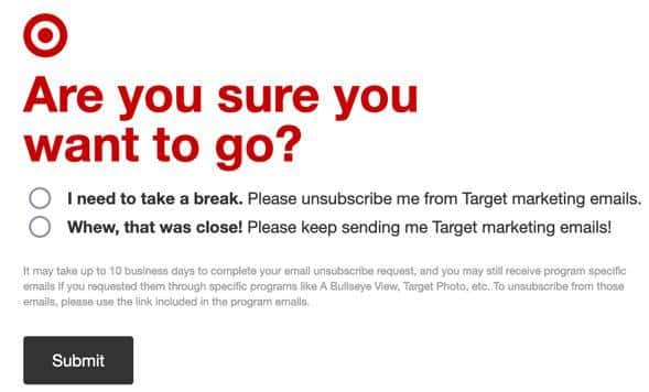
This Target opt-out page shows how to incorporate brand voice, which is casual, optimistic, even a little playful. And while I just advised against monkeying around with alternate terms for “unsubscribe,” I like how Target framed its unsub request as “I need to take a break.”
This opt-out page from DSW (US) is more in-your-face:
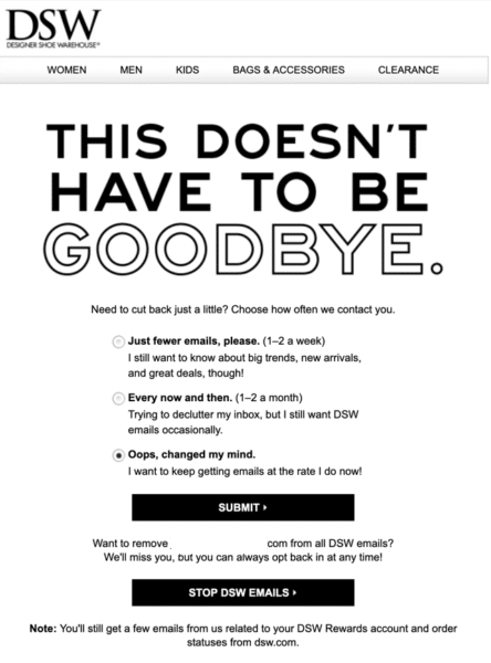
Always give your subscribers something to click on your opt-out or confirmation page. Keep the unsubscribe field prominent but add a list of your other email offerings, links to your social media sites or your mobile app, a link to their customer account or a link to your homepage.
People who opt out of email aren’t necessarily turning their backs on your brand, but if you don’t give them options to stay connected, you’re turning your back on them.
Don’t forget the most important step in the process — make sure it works! This starts with the unsub link in your email and goes all the way through to make sure the unsub or preference-change request is honored in your database. This should be a standard step in any email audit, especially if you change ESPs.
Unsubscribing and holiday email
Ideally, you’ll bring in loads of new subscribers during the holidays. But that also can mean more unsubscribes.
Some customers who opt in just to get an incentive or buy a gift for someone won’t be interested in staying around and might not be invested enough in your brand or email to take the extra steps needed to unsubscribe.
Instead of having them go inactive or click the report spam button, send them on your unsubscribe journey to find other lists of yours that might be more appropriate, choose a different frequency, or connect with you on social media, in a mobile app or direct mail.
Dig deeper: The best unsubscribe email is the one you don’t send
Always make it a fond farewell
As rocky as the unsubscribe process can be, it’s one of the ways email differentiates itself from other marketing channels.
How many times do you find yourself watching the same obnoxious TV commercials and wishing you could opt out of some brands? Has anyone ever successfully opted out of unwanted direct mail?
A reliable unsubscribe process also puts email marketers ahead of the game in this age of privacy laws and gives people the right to remove their personal information from a company’s database. Years of training have helped us break some bad unsubscribe habits.
The greatest lesson I hope you take away from my findings here is that the unsubscribe process is an essential part of your customer’s experience with your brand. Get it wrong, and you could lose a customer. Get it right, and you might lose a subscriber but retain a buyer. That’s a win!
Get MarTech! Daily. Free. In your inbox.
Opinions expressed in this article are those of the guest author and not necessarily MarTech. Staff authors are listed here.




![Social Media Spring Cleaning [Infographic] Social Media Spring Cleaning [Infographic]](https://imgproxy.divecdn.com/9e7sW3TubFHM00yvXe5zvvbhAVriJiGqS8xmVFLPC6s/g:ce/rs:fit:770:435/Z3M6Ly9kaXZlc2l0ZS1zdG9yYWdlL2RpdmVpbWFnZS9zb2NpYWxfc3ByaW5nX2NsZWFuaW5nMi5wbmc=.webp)
![5 Ways to Improve Your LinkedIn Marketing Efforts in 2025 [Infographic] 5 Ways to Improve Your LinkedIn Marketing Efforts in 2025 [Infographic]](https://imgproxy.divecdn.com/Hv-m77iIkXSAtB3IEwA3XAuouMwkZApIeDGDnLy5Yhs/g:ce/rs:fit:770:435/Z3M6Ly9kaXZlc2l0ZS1zdG9yYWdlL2RpdmVpbWFnZS9saW5rZWRpbl9zdHJhdGVneV9pbmZvMi5wbmc=.webp)


.jpg)


